Avonmouth Station
‘Reinvesting for the Future’ programme was the redevelopment of one of the fire stations – Avonmouth
The Project
Avonmouth is the first in a suite of new fire stations being rolled out in the service area. The focus was on delivering an optimised working environment for the staff, improvements that will both progress operational efficiency and prevention work, as well as ensure staff had dedicated spaces that enhance their day-to-day working life.
Currently within the Service there is a mix of old and newly developed stations that can be very sterile places to work and rest in, given that only functional consideration has been considered previously. Our stations would generally have endless white corridors or old outdated images of motivational messages in warped small frames, with little or no signage to help someone from detached duties or general public find their way around. An initial brief was to look at the internal and external branding, manifestation for glazing, artwork for a breakout room, as well as corporate colours for specific zone areas.
The brief
As a designer I knew the space needed so much more and so revisited the brief and set a challenge to reconsider the space by working closely in collaboration with the station to understand how they worked and listen to their ideas. Over the past two years the Service has undergone a huge culture change programme and so I was keen to bring our culture and values to life through the design.
The design also had to be a far more conducive environment that could support staff in downtime, provide a productive space for creativity and team working and, most importantly, create a reflective place for teams who can often face very challenging situations.
As a result of this collaborative work and appreciation from the station of looking at the project through a design lens, the project scope grew to include more functional installations such as high performance drywipe, magnetic surfaces, specific “wellbeing” wall treatments, signage and wayfinding was also included in the roll out. This new station had to have create a safe space, be functional for workspaces, achieve a positive environmental impact and practical working environment.
The challenge and objectives
The initial brief was to create some bespoke artwork for the mess area (the lounge and dining area) that most likely would feature an area of Bristol. Due to COVID-19 there was a year gap before we were able to embark on the project. At which point I knew the project could be so much more. The Service had undergone a culture change programme in the years prior. After seeing our response to COVID-19 unfold I was more determined than ever to consider the project in collaboration with the Station and how they used their workplace. I therefore re-wrote the brief so that it could go further and look at what the combination of what clever print and design could do. We had a small print budget and so we had to be think imaginatively and be conscious of cost effectiveness.
Studies have shown that enhancements in the working environment particularly with art can help reduce stress, increase productivity whilst enhancing morale and supporting well being.
The objectives:
- Work closely with the Station to optimise efficiency of the workplace
- Design for wellbeing in the workplace, visually enhance work and rest areas to increase moral and display our values.
Target audience:
Have an audience led approach and work closely with the Station to study how they use their space and ensure there are lots of opportunities to discuss ideas and later market test the solutions
Key project deliverables:
Efficiencies
- Drywipe wall vinyls for kit checks, Riders information and day to day running of the fire station
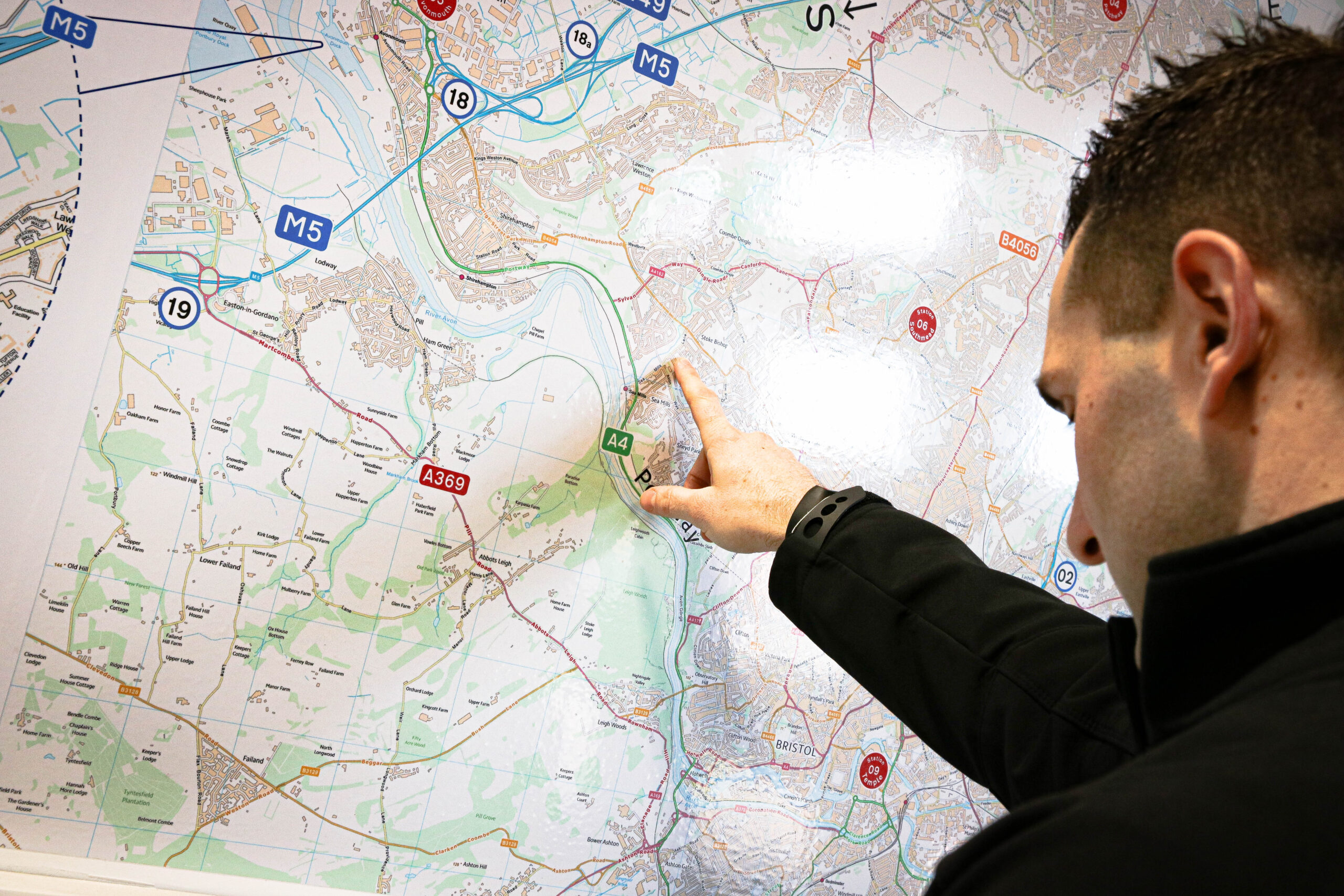
- Re drawn Highways England Maps
- Specific location area OS Maps to help get the crews to the right place, which are also drywipe.
- Magnet and drywipe areas for notice boards
- Table wrap graphics to help with reconstruction/training
- Way finding across the station
Enhancements
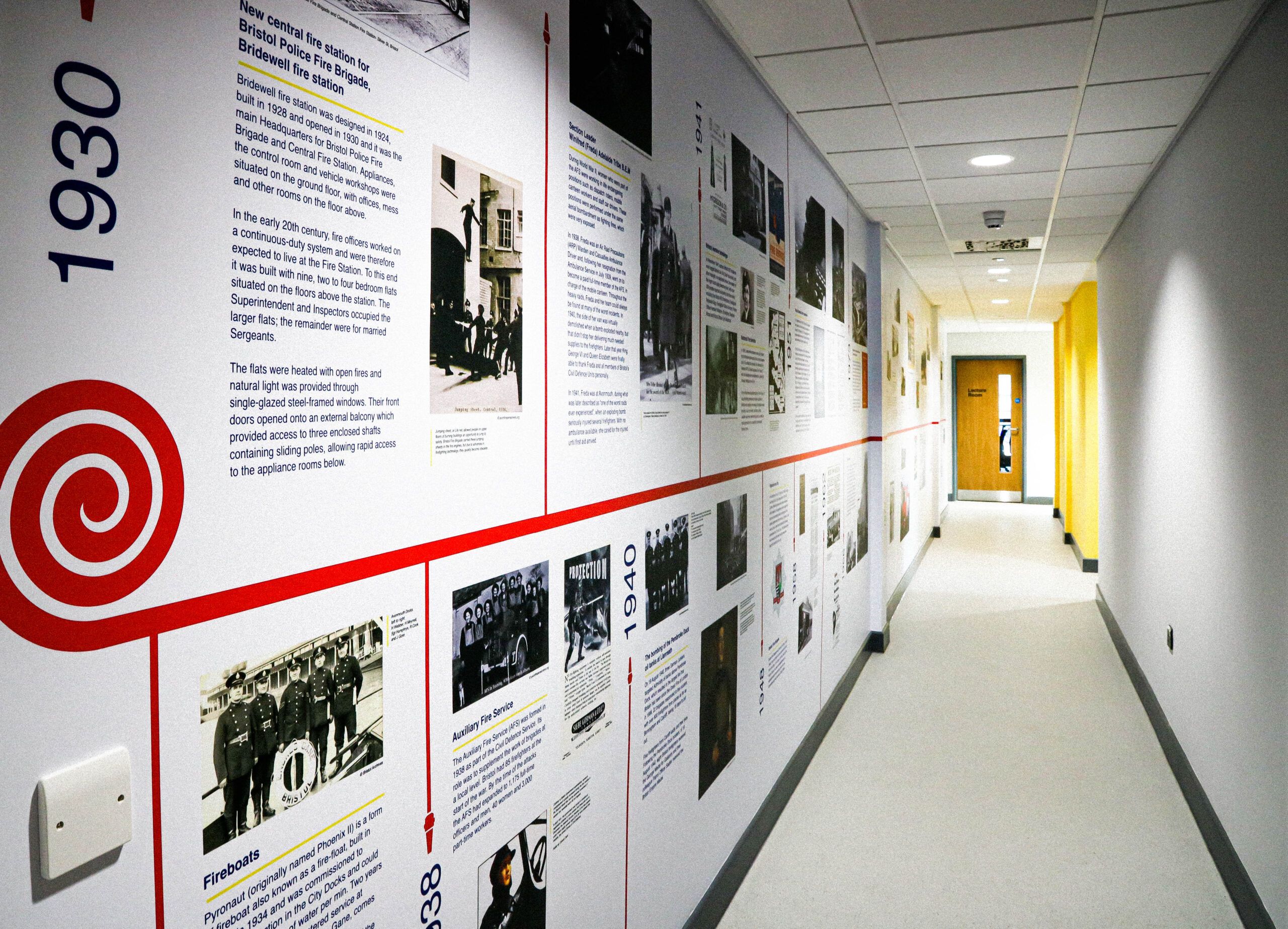
- 12 metre timeline covering just under 100 years of the Fire Service that covers the length of a corridor
- Cut vinyl drywipe speech marks for complements from staff to write in
- Highlighted area’s painted in corporate colours
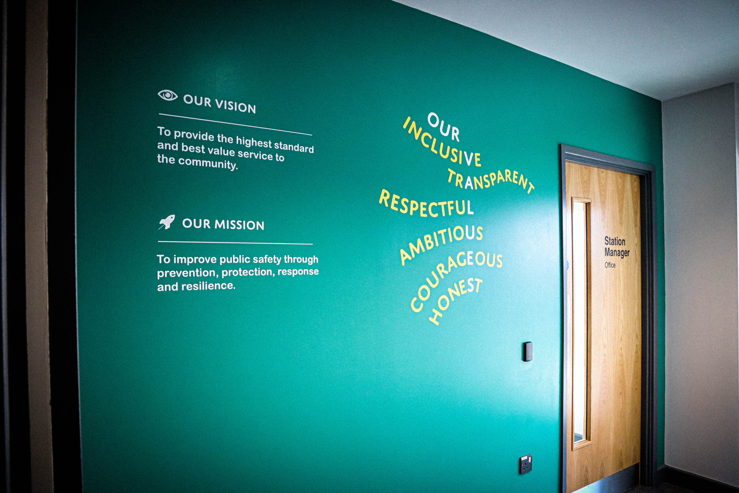
- Cut vinyl values in entrance lobby area
- 1 large bespoke piece of graffiti wall cantered around Bristol
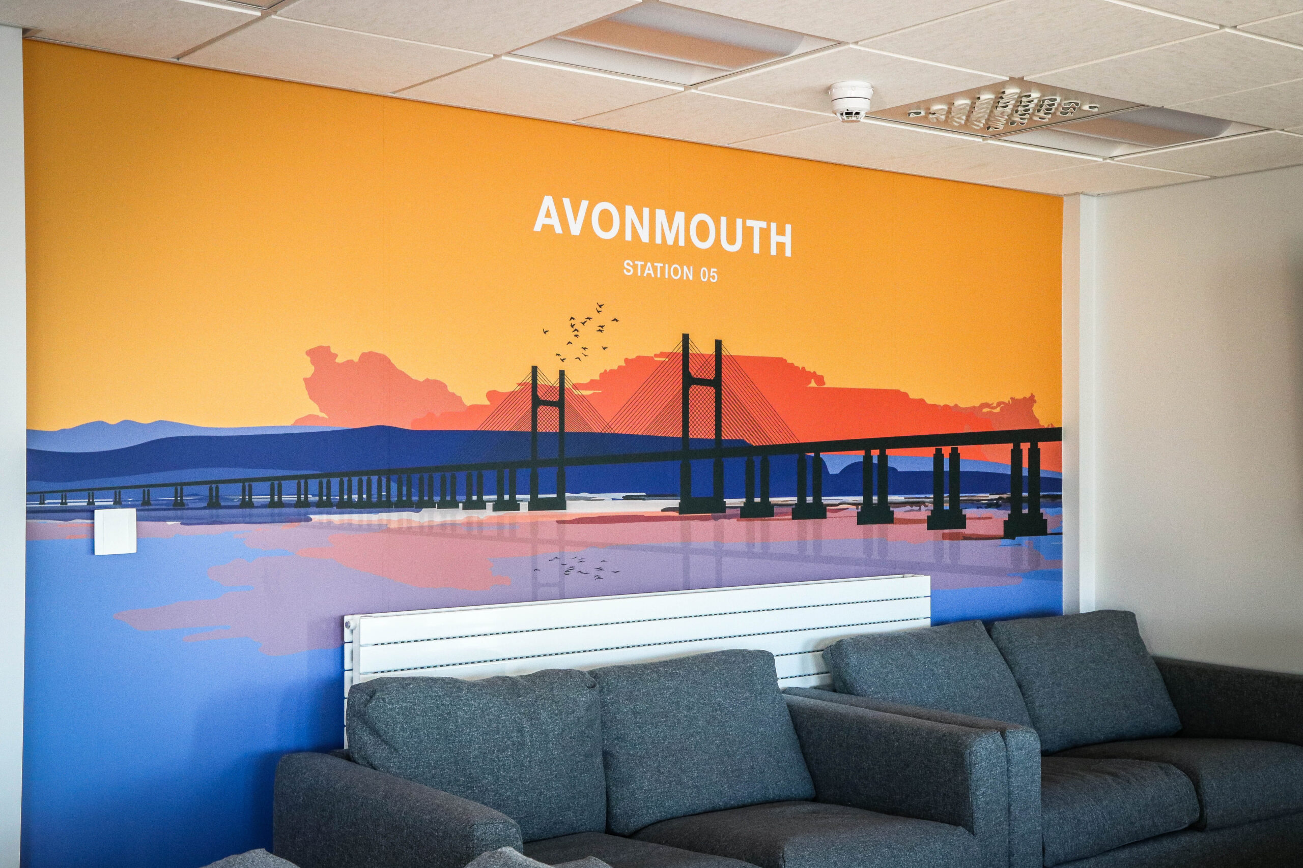
- 1 large wall vinyl focused on Avonmouth.
- Exterior Signage
Design Solution
We had additional months to play with due to build delays down to COVID-19, which meant we could be even more ambitious and customer-focused in our design approach, in this case the customer being Firefighters. A focus group was set up with a particular Watch and this became the go between for the other station and steered decisions and inputted ideas. The station had a lot of legacy ways of working, which were not always the most productive way of producing results, so by working with the Watch and sharing initial ideas it really helped to get to the crux of solving some problems.
Each time a large format piece of work was created, it was taken to the station and tested in a real scenario. Kit check and Rider information were put through the passes and changed numerous times to get the sizing of the artwork and specific need to know information correct. Sections of maps were passed around at different scales to make sure the size and scale worked for the crews and were legible at the required size.
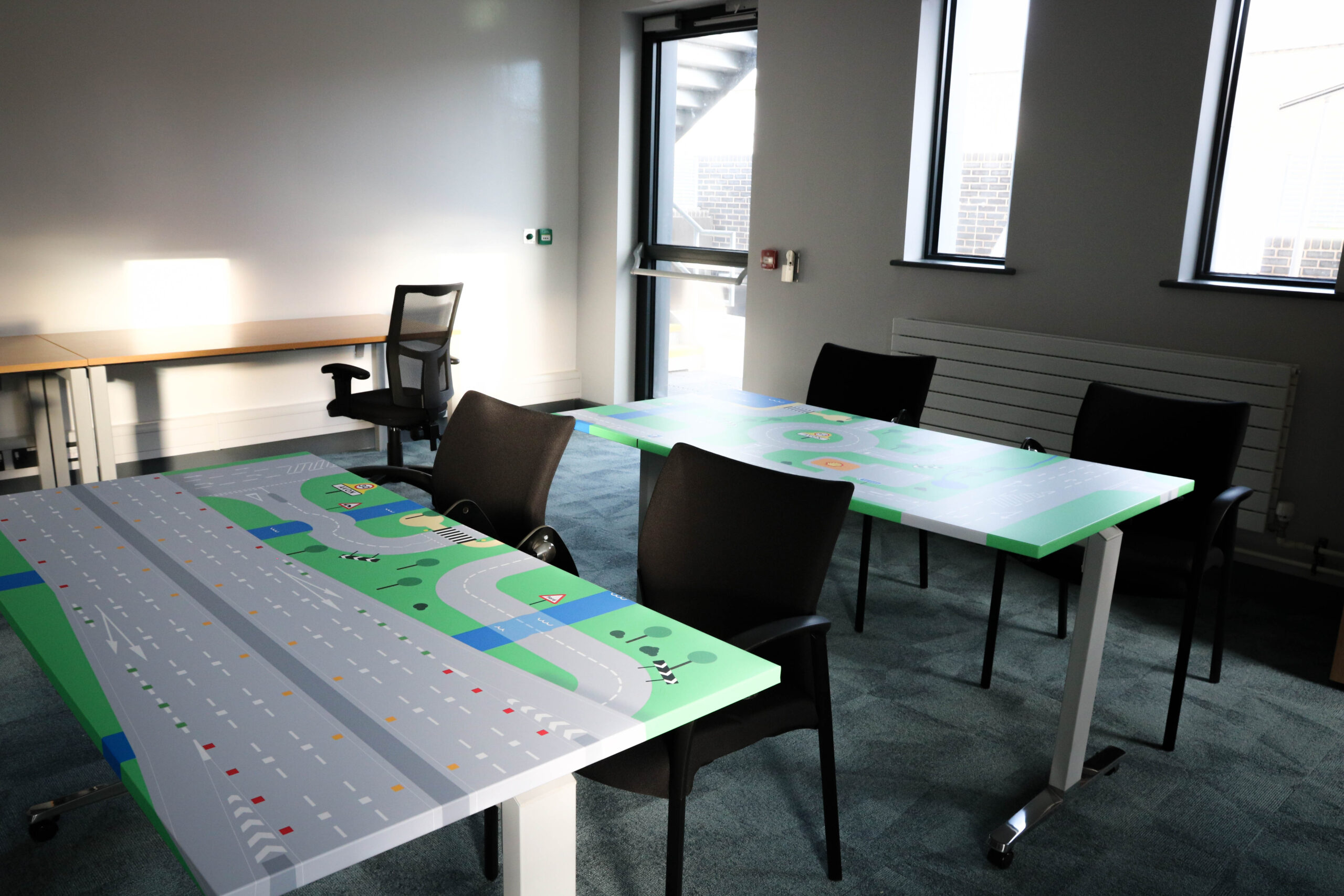
The lecture room has now two large writeable walls for scenario training and planning, achieving a positive environmental impact given that they were previously used to an A2 notice flip chart. Paper waste has been quickly reduced and the board now allows for easy collaborative working. Along with two table maps for reconstruction, scenario training drawn specifically with a list of requirements.
Efficiencies
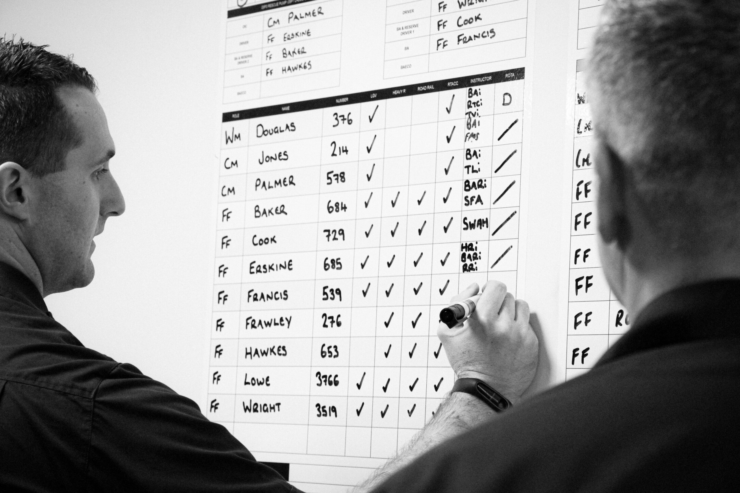
- Drywipe wall vinyl’s for kit checks, Rider’s information and day to day running of the fire station. Using the drywipe materials allowed for greater use of location and visibility across all the watches.
- Working alongside National Highways allowed us to produce the very latest up to date major motorway and road information. A design was completely redrawn to better relate to the Firefighters to enable them to see quickly junctions and key location points. Printed in drywipe vinyl and situated in the Appliance Bay.
- We created a large ward area OS map to enable crews to view and ascertain which area they were covering. Printed on drywipe, allowing the stations to self colour. We included major roads and placenames surrounding their local coverage area, along with direction of travel for the drivers. Again, this reduced re-print of local ward maps that would easily disintegrate with use.
- We replaced small notice and white boards with drywipe walls instead
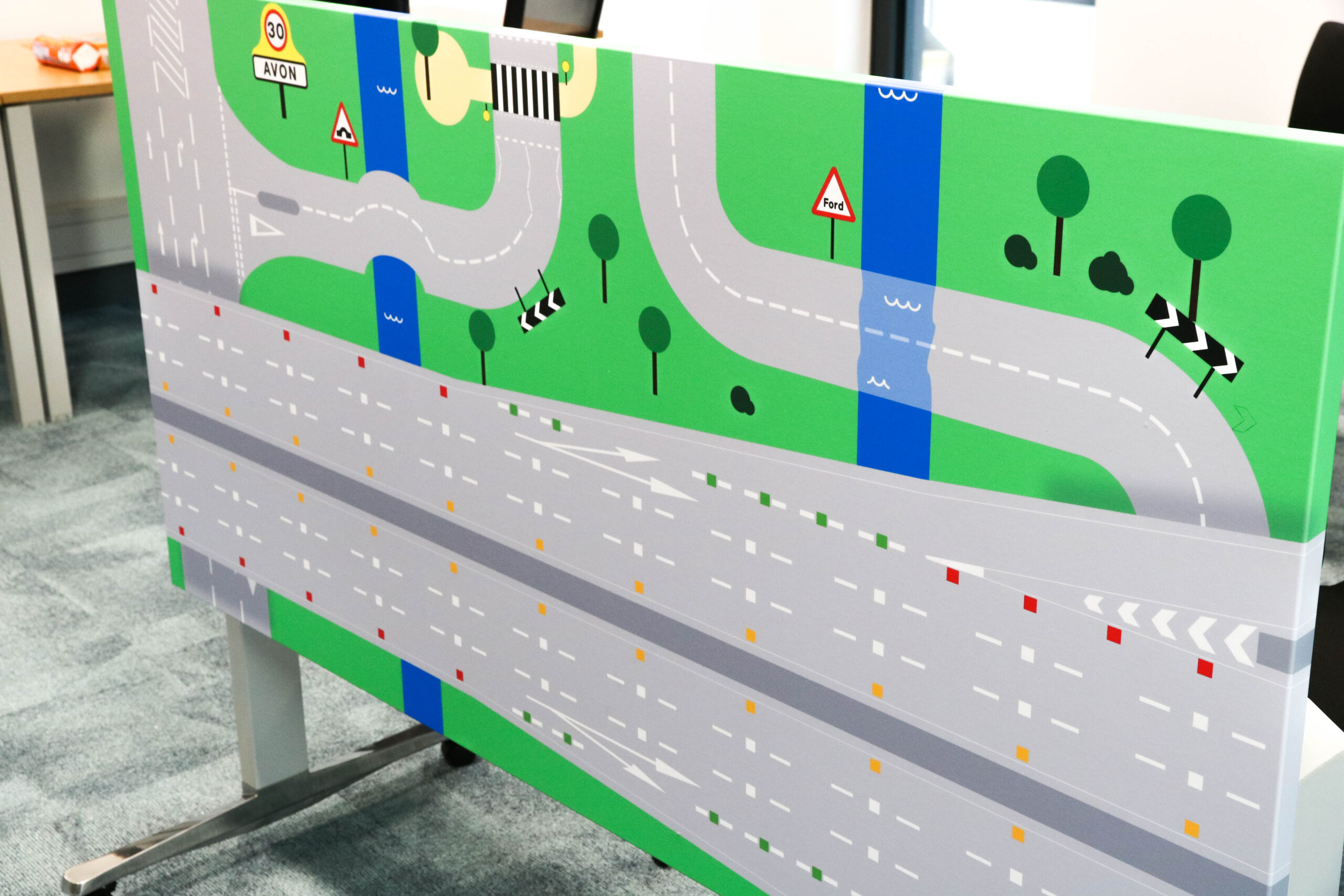
- For reconstruction, scenario training two bespoke vector drawn maps were created with a list of “must haves” such as bridges, roundabouts, walkways, fords. To give authenticity to the maps themselves, even small detail to the lettering used on the signs were given consideration and created in the same style of British road signs, fonts like “Transport and Motorway” were used. The maps were then printed and wrapped around desks for the station to use with miniature cars and engines.
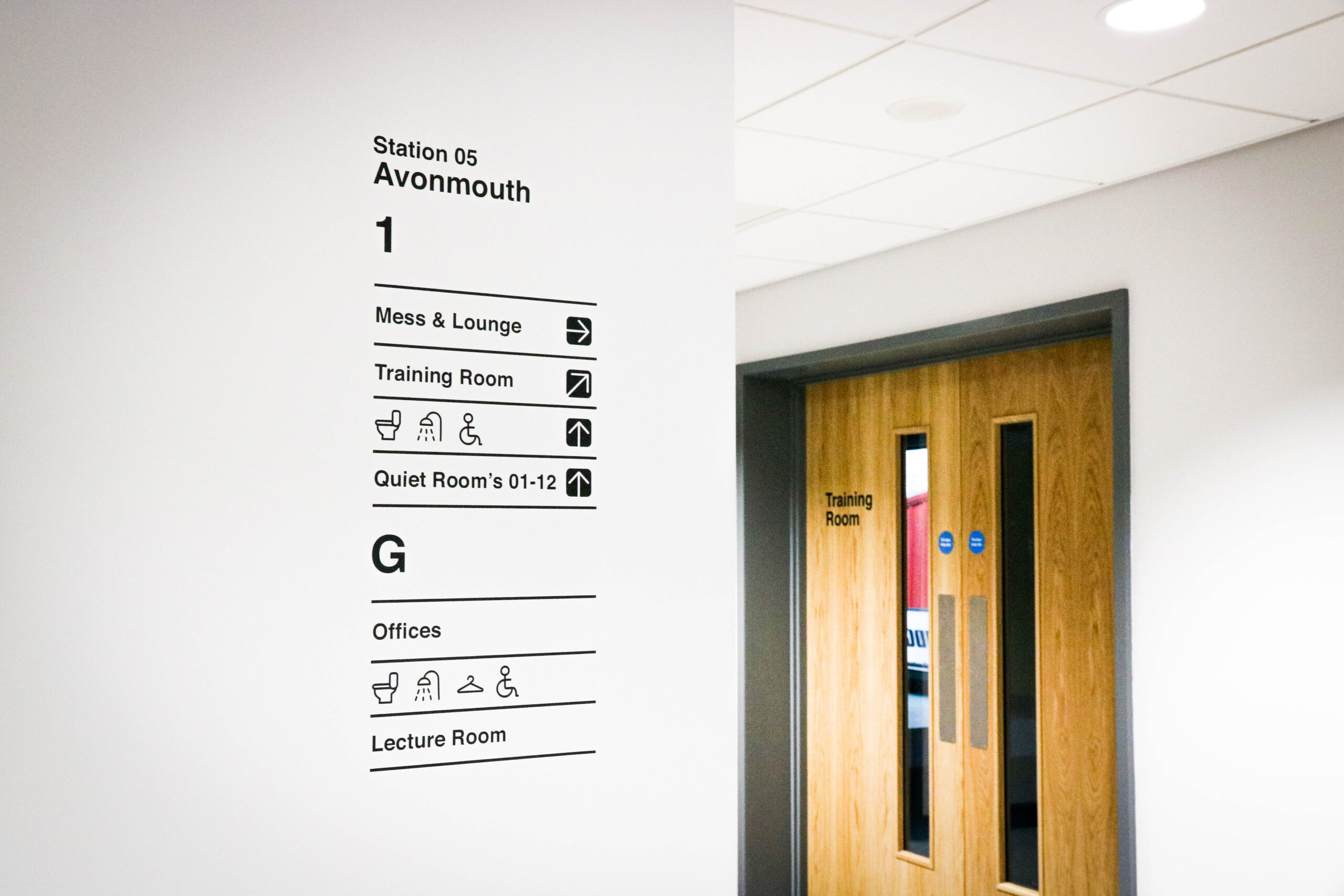
- Visitors or Firefighters on detached duties find it challenging to find their way around the station and so we added wayfinding. Careful consideration was made to unisex and women only toilets as well to give a safe space.
Enhancements
- We developed a 12 metre timeline covering just under 100 years of Avon Fire & Rescue Service to show where the service has come from and celebrate all the achievements and advances made over the past nearly 100 years. Collaboration with Bristol Archives, Imperial War Museum and a couple of retired Firefighters played a vital role in information gathering, all logos and marks were re-drawn and enhanced from across this period.
- Area zones were picked out to indicated things like a new levels or a breakout area. We had a noticeably clear set of corporate colours to use, and these considerations were made from a lighting perspective, guidance from the colour psychology theory was used. For instance, yellows and oranges were placed in the gym to promote happiness and energy levels, blue was used around our compliments wall for trust and so on.
- Compliments are received daily by the general public, so wanted to devise a way of capturing those for the stations to see and boost morale, particularly if it’s been a challenging shout and so we used cut vinyl drywipe speech marks for compliments from staff to write on.
- Mission, Vision and Values in entrance lobby area
- We developed bespoke Artworks for the station. Allowing this collaborative piece to happen allows a sense of ownership but gives a feeling of control which has been linked to enhanced professional performance at an individual level as well as at group. Artwork consisted of a commissioned piece with local artists from Upfest and artwork developed in house depicting the Severn Bridge
- Exterior Signage was so important due to the station still having old “brigade” signage. we devised solution that could be used across all stations however big or small. Utilising AF&RS name and star alone and doing away with the logo itself the name of the station and the Service became so much clearer and concise read at a distance
